SeatGeek has a wonderful product but I feel we're positioned in the market a lot better because of the access to a large number of primary tickets. We can uniquely do some things (like giving fans early access to onsales). Our products are currently lacking but we have many things internally going on that will change that.
(If you are in LA and would be interested in helping, email me)
What was missing in the WWDC announcements when the Spotlight improvements were discussed was web search. Apple will probably want to acquire DDG and cut itself off of Google completely adding it's own web search to Spotlight and Siri.
DDG is a little ways from being a full Google replacement. Apple can ill afford the backlash they saw with maps happen again. Remember your simply shifting the notion of anonymity and data from one large company (Google) to another large one (Apple). All device makers gather your data and will use it (if they aren't already) hopefully for the benefit of the users. Instilling fear isn't the solution, clarifying the use and usefulness of data is.
Apple hasn't proven itself to be a dick. We trust them implicitly because they have reliably proven that they have our interests at heart, and we pay them to be trustworthy.
Google has proven to be a dick. We distrust them implicitly because they have reliably proven that when faced with a choice between the interests of their nonpaying users and their paid-up clients, they invariably work in the interests of money.
We all still view Apple with some degree of suspicion because they're in the USA and thus NSA happens.
What I'd prefer to see in addition to iCloud is either nationally-hosted iCloud for non-US countries, or self-hosted iCloud services for people who want to be in control of their own security.
For me it's been a Google replacement. The results have become really good recently.
At this point I feel the main difference is the personally ranked results. Once you get used to the page you want being 4th or 5th on the list rather than first, you realize the trade-off is worth it.
I wonder if Snowden and co. were that stupid to keep all their files with Miranda. The fact is the gov can never be sure if whatever he was carrying is in fact the complete set.
I've been using iOS7 since Beta 2, and I still hate it.
I don't like the look, but this might be personal. So putting this aside, to me iOS7 is actually harder to use. The flat buttons (which are just labels now) are harder to press. I do not know if this is psychological since they appear smaller, or is it that the target area is actually smaller now. Toggles are grayed out in their off state, so they appear disabled, as in "you are not supposed to be pressing it now" (see Speaker control in the Voice Memos app).
There are also a lot of other things they changed during the redesign for worse from my perspective. For example: in the Voice Memos app I used to be able to record and play back a sequence quickly. Now
* I stop recording a sample
* Press Done
* Am forced to label it (why!!)
* Expand the memo I just recorded (why is it collapsed - I am still working on it)
* Hit play
I record 20+ samples a day I need to listen to quickly, and this is so frustrating.
There are other things like this throughout the OS. In calendar for example you can't expand the Notes on the meeting, so god forbid someone puts important meeting information there.
It seems to me like people at Apple actually stopped using their phones. These little things scream at you once you actually try to get something done.
I had issues with the controls that appear during a phone call. I've been an iPhone user since day 1, but the borderless buttons made me hesitate and hunt around for the button I actually wanted to press. Apple fixed this in Beta 4 or 5 and I feel much better about it.
I still find the Repeat/Shuffle buttons confusing in Music.app and I hope they gets fixed before GM.
font-weight is indeed the main problem, but regardless I hate this new trend of not making text black. What would a bookmarklet look like to set the body color to black?
The trends to make thin grey text on nearly-gray background are driving me nuts also. I have two global Stylish [0] styles in my Firefox and I toggle them when I need to read something on a page like this:
1) Enable Georgia font instead of the author's favourite thin font:
html body, html div, html span, html p {font-family:Georgia !important;}
2) Make everything black (except links):
html * {color:black !important;}
a {text-decoration:underline !important; color:#00a !important;}
Those are not perfect but they work for me in 95% of the cases.
The first rule is a not a catch-all to not put Georgia in code/pre/textareas etc. `html` is necessary not to affect Firefox's (browser) styling.
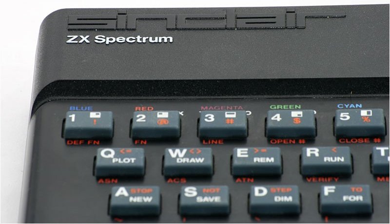
The on-screen keyboard reminds me of the good ol' days of ZX Spectrum (each key had a command assigned to it, you typically wouldn't type the commands but press the corresponding button)
No, but I do scroll the page up, so that the line I'm reading aligns with the top of the browser viewing area.
Some sites nowadays add a floating header to the top of the page that changes size as you scroll down which is super distracting when reading the way I do.



SeatGeek has a wonderful product but I feel we're positioned in the market a lot better because of the access to a large number of primary tickets. We can uniquely do some things (like giving fans early access to onsales). Our products are currently lacking but we have many things internally going on that will change that.
(If you are in LA and would be interested in helping, email me)